IPB app

Project Overview
An open-source mobile app for the Central Presbyterian Church in Palmas/TO.
This is a volunteer project I'm leading together with my friend and Flutter developer, Victor Lustosa. Victor is a member of the Presbyterian Church, by watching some needs of the institution, he came up with a concept idea for the app and invited me to design and work on the user experience.
The MVP is already available on the Play Store 🥳. App Store is next on the line (jun/23).
🙅🏻♀️ My role
Solo UX|UI Designer
⏳ Project timeline
1.5 years - ongoing
🎨 Design stack
Figma
1. The Briefing
In a meeting with all the stakeholders, we gathered the requirements and needs, to really understand how the app would be beneficial to the church.
Some of the problems this specific institution encountered were:
manage members
Tracking new members, getting their information and getting to know them.
manage ministries
Supervise teams, organizing and onboarding volunteers.
communication
Offering a focal point of communication with members (converging website, social media and whatsapp).
events
Administrative and finantial tools for promoting and managing events
programme and archive
Showing the liturgy of the service and songs being sung by the community
offering
Bank information and go-to place for offerrings and donations.
Some other requirements were:
minimal design that could accommodate the church visual identity
reducing the costs of the project (whe it comes to data storage, etc)
easy, intuitive features that could be enjoyed by a large audience (from 10 to 90 years old)
Design requirements
Once we knew we would like it to be an open-source project, to contribute to the community, I gathered other requirements for the design department (aks myself):
Design system
develop a complete design system full of instructions and recommendations (design variations and template options for easy rebrand of the app).
Broad personas
test the app with the general public to come up with extra features that could be suggested/inlcuded
Oragnization
have a neat figma file for sharing s2

What a challenge to my team of 1 person, right?!
But I was excited for it!
2. The Research
For the research phase, I kept it very minimal and essential:
-
a few user interviews with key members to understand the needs of each department
-
gathered references and
-
performed a quick market audit
User interviews
Here's an example of the kind of insights we were able to collect from user interviews:

Visual references
Thinking about the features that the app might have, I like to gather references from Mobbin, Dribble, and Google.
This helps me framing already the layout and start thinking about the visual design.
Can you recognize some of the apps below?

Market audit
The market for church apps is very stiff; there are companies that offer a bundle of website + app, both of them from a few template options.
Personalization is more of a branding point of view, rather than fulfilling users needs.


So we had the opportunity to make something highly personalizable that could benefit church communities!
3. Ideation
For ideating, I always start with user flows, and I actually enjoy bringing the team together for a workshop.
I also already think about user experience and try to include in the flow where there could be opportunities for animations, interactions, etc.
In other to provide management autonomy to the institution, we created 2 flows: one for the administrators and the other for general users.

4. Prioritization
Prioritizing for the MVP was definitely a challenge! What would be the most important feature to be launched first? What else to include so we could have a nice first experience in the app?
To answer these questions we spend some time in meeting with stakeholders, presenting design decisions and some options for different flows in the app.

Ultimately, we closed on an MVP that would include:
Home - access to service pages

Service page

Songs

Lyrics

Offering

5. High-fidelity prototype
I designed more features beyond the MVP scope, in order to have a better idea of the app structure and product roadmap, as well as broader user testing results.
So, my prototype also included:
- some sections for the administrators (adding songs, scheduling events, editing texts, etc)
- about section
- calendar/agenda
- service playlists
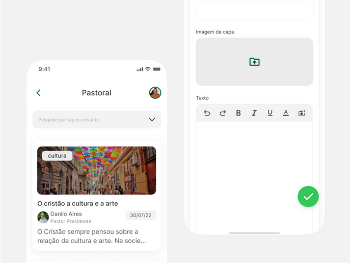
- articles
Sharing even Figma bugs because they are real! 🤷🏻♀️
6. User testing
Fail fast they say, right?
We did 5 user testing with different leaders and members of the organization and here are some example of my findings:

Learnings
👯♀️ Devs are friends
The rewards of actually collaborating with developers early on (even before/during research) are amazing. Their views and inputs are so valuable that can actually make designers life a lot easier (as we are able to make their lives easier as well by understanding technical constraints and details). So, go talk to your developers!
✨ Early user testing
Early user testing is beneficial when you’re the only designer in the team. Users can be your co-creators when you’re designing solo. Just remember to have qualified users and clear goals in mind for the testing.
📝Documenting
I am learning to create better systems to myself, in order to document my work. What is really working out for me managing multiple projects is having a database with templates for every piece of doc I can think of. Another tip I received from one of my mentors, is having a note pad beside you when you’re working, so you can annotate the most important decisions being made. Then I make sure to update the project page on notion and the action points.
Thank you for reading through this project!
I promise you'll also enjoy the next one


